 |
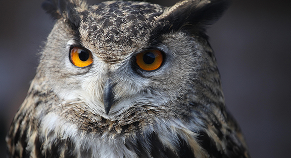
| An owl’s excellent vision is enhanced by its ability to swivel its head a full 270 degrees. |
Owls are renown for their field of vision and excellent night vision. This is due in part to eyes that are very large in proportion to their skull. We humans are not so blessed (perhaps that’s just as well…), so as we age many of us tend to lose some aspects of our vision. Fortunately, we humans can design our spaces to accommodate our changing needs.
• Curbs, wheel stops and other changes to the level of paving to be of contrasting color an value (in addition to those surfaces with red fire lane paint)
• Direct East and West facing building exposures should be avoided when siting the building. Avoid uneven walkway surfaces. Exterior and interior stairs, ramps and steps, if required, should be designed with leading edges (nosings) that clearly contrast in color and value with treads and risers. Place drains and grates outside of walkway areas.
• Create transition areas between the exterior and the interior of the building to allow those with Low Vision a place to pause to allow their eyes to adjust (larger than typical vestibule with seating)
• Site furniture should be placed well outside the circulation path and should be lit and of contrasting color to prevent collision or a tripping hazard. Raise fountains or planter beds placed in the circulation path and utilize contrasting materials.
• Trees should not have low hanging branches nor should they drop fruit, nuts or cones next to paved walkways.
• Signs mounted on walls are preferable to pole mounted signs. White letters/information on a black background is best (just the opposite from what is typically used!) Avoid raised letters due to the shadows. Because of the danger of glare, avoid backlit signs including LCD type displays except LED type lighting which works well.
• Use card or proximity readers rather than numeric key pads or keyed locks at well-lit entry points.
• Specify shields cut-off site lighting fixtures.
Building Considerations
• Exterior louvers and light shelves help to provide luminance balance.
• Use Low-e solar glass. Consider reflective coatings with exterior and interior shading.
• Public entrances must be easily identified as such from the street. Secondary or service entries can be confusing if they are too visually prominent. Make the entry door(s) visually distinguishable from sidelights and other adjacent features and wider than typical (up to 48” wide for those who are being accompanied by another)
• Touchscreens for the building directory and wayfinding information should provide fonts and graphics that persons with Low vision can read. Augment this display with sound.
• Furniture in a lobby space must be positioned and be of color values to be easily seen and to avoid accidental collisions and fall risk.
• Railings and handrails in circulation areas need to be a contrasting color and value.
• Hallways and corridors need to be 4 feet wide minimum (Person with escort).
• Non-chrome plumbing fixtures. A darker oil rubbed finish set on a white fixture may be best.
• Specify contrasting floor surface in restrooms so white fixtures can be located easily.
• Avoid highly polished (granite) counter tops.
• Avoid highly patterned or textured finishes on floor and countertop surfaces which may make retrieval of small dropped items very difficult.
• Avoid Rugs.
• Use cabinet drawer and door pulls which can be easily seen and which contrast with the cabinets.